|
LITUANUS
LITHUANIAN QUARTERLY JOURNAL OF ARTS AND SCIENCES
Volume 21, No.4 - Winter 1975
Editors of this issue: Antanas Klimas, Thomas Remeikis, Bronius Vaškelis
Copyright © 1975 LITUANUS Foundation, Inc.
|

|
A CONVERSATION WITH ROMAS VIESULAS
ABRAHAM DAVIDSON
Tyler School of Art and Temple University
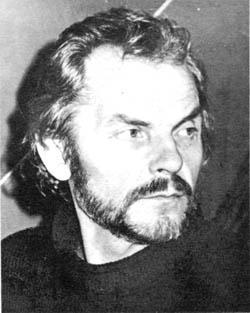 |
Romas Viesulas was born in Lithuania, in 1918. In 1945 the tides of war forced him to leave the native land. Viesulas completed art studies in emigration, graduating from the Ecole des Arts et Metiėres, Freiburg i/Br., Germany in 1949 and the Ecole des Beaux Arts, Paris, 1949-1950. Presently Viesulas is Professor and Chairman of the Department of Printmaking, Tyler School of Art, Temple University, Philadelphia, Pa.
Prof. Viesulas has received world recognition for his prints. He has been awarded numerous fellowships, including the coveted Guggenheim Fellowship in 1958 and 1964. He has exhibited his works in numerous one-man and collective shows, nationally and internationally. His latest international participation was in 1974 in the International Biennial Exhibition of Graphic Arts and Multiples in Segovia, Spain. Viesulas' prints are included in the permanent collections of the leading museums of the world, including the following: Bibliotheque Nationale, Paris; Art Gallery of New South Wales, Sydney, Australia; Museum of Modern Art, Kamakura, Japan; Central 'Library of the Lithuanian Academy of Sciences, Vilnius, Lithuania; Museum of Modern Art, New York; National Gallery of Art, Washington, D.C.; and many more.
The following is a conversation with the artist on the creative process, conducted by his colleague at the Tyler School of Art Prof. Davidson.
|
Abraham Davidson. You're a printmaker rather than a painter. Would you say something about the medium with which you work.
Romas Viesulas, My media have changed over the years. I started to be known as a lithographer in this country. Yet, I work interchangeably with other media as well, as I am trained in most known graphic media, i.e., woodcut, lithography, etching, silkscreen, etc. Recently my main interest has been in inkless relief, inkless intaglio. I'm also interested in the woodcut, which I've neglected for some time. There has been a resurgence of my interest in this medium in the 1970's while I was in Rome and started to work in oversize prints, some of them ranging from five by eight to six by thirteen feet.
A.D. So you've given up lithography by and large. What, then, are some of the effects you could get these other media that you could not get from lithography?
R.V. I think that in the late 1960's I became fascinated with relief as such, or the dimensionality of the print. That's probably why I moved away from lithography.
A.D. As prints raised from the surface?
R.V. That's correct.
A.D. And you get such effects through intaglio and woodcut?
R.V. There's a certain tangibility of the surface that one senses in looking at the print. This interest came and went, but I'm still fascinated by it — whether in my white-on-white prints or black-on-black prints, a recent trend in my work; or be it combined, as for instance, in the "Yonkers" series. I like to use a cross-section of media from lithography to inkless relief to inked relief, and so on.
A.D. Without going into a great deal of detail, can you say something about the way you make your prints.
R.V. Since my postgraduate years in Paris I have been trained or rather encouraged to work in the medium directly, rather than to transfer the image from drawing to the medium. Not only do I like this directness
of approach but I encourage my students to do likewise.
A.D. Now to some of the prints themselves. I see in this one — I seem to see a horse here...
R.V. Most often objects have been used in imagery — in some relationship or form.
Many of my prints have some specific reference, yet the directness of that reference is often ambiguous and manifold; and the readability or the projection of the image would often vary very much from viewer to viewer.
A.D. This sounds somewhat as an Abstract Expressionist would speak of his work or an Abstract Expressionist critic would refer to Abstract Expressionist paintings — this multiplicity of possible readings. Do you see any connection between Abstract Expressionism and your work? On the surface there would seem to be.
R.V. Not quite. I do have elements of expressionism as such in my work, no doubt; but the content is not related to Abstract Expressionism, as I do deal with specific objects, while the Abstract Expressionist concentrates on the action, I would say, the movement, the impact of the actual handwriting or brushstroke. True, this should be qualified. If you think of de Kooning, the reference would probably be close to what I have in mind; but if you think of the others, the parallel would not be close.
A.D. Some have said that Abstract Expressionism is a poly-referential art, that is, one which has many
references at once. But back to your work. Would you say that you are an improvisational artist mainly, that what happens in the work begins to unfold in the process of working or is much of this planned beforehand?
R.V. The idea is usually planned beforehand. I do not touch the work, I do not start the work until I have a specific idea, or a very specific impact in mind.
"Yonkers I". Color Lit. 1967. 26x41 in.
"
Imminent." Intaglio-relief. 1967. 26 3/4x36 3/4 in.
"Annunciation." Vinyl cut on fabric. 1970. 54x98 in.
"Self-portrait as a Potato" Intaglio-relief. 1967. 26x39 in.
A.D. Is this in mind, or do you sometimes make sketches?
R.V. In mind.
A.D. So you visualize. ..
R.V. That's correct. When it comes to work, I often do research, I draw specific objects which interest me for that idea. When it comes to the work, to the drawing, I have a very powerful reference, so you see the idea does not develop completely in the process. The image is actually preplanned, envisioned. Sometimes a drastic change is introduced as the image develops, but the idea I'm after remains from the very start before I touch the print. When the work emerges, the idea may sometimes be in a very different aspect, yet basically the same.
A.D. I'm not quite sure what you mean by this term "idea". In this work what is the idea? Is the idea a certain kind of disposition of the elements, or is the the "idea" a certain subject?
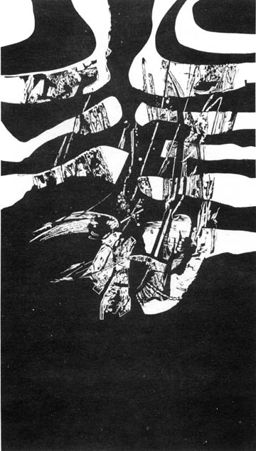
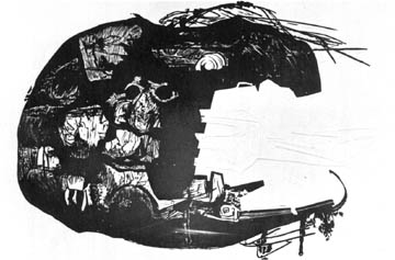
R.V. That work is part of a larger series "Hew" on an Aztec theme. The theme of the entire series is the tragedy of the Aztecs when they encountered the invasion of Cortez, and the subsequent defeat of their tribe. I deal with the series allegorically. There are many elements of battle, disaster. In this particular series I deal with the time when the situation for the Aztecs is grim, progressing from imminent threat to disaster, when their civilization is in destruction. It does not read particularly in terms of recognizable objects. Form example, this which you have next to you is "Cuauchtemoc". He is a historical person, an Aztec chieftain, a very young and seemingly brilliant leader, who was tortured and hung by Cortez after he had been burned and physically broiled on fire. If you look at the print, you can probably recognize certain tortured forms — they could be animal, they could be human, with a certain dorsal quality, a kind of torso, a certain deformation. At the same time you really can't identify as Cuauchtemoc. So, in a way, the readability of the message is manifold. You could probably sense a certain
mood from it, a certain message, without relating it to the Aztecs specifically.
A.D. I see this drawn out figure hanging, this tortured aspect. Yes, I see that.
R.V. So in a way it does enter into Expressionism. But in the way it is put on the page I would say that you
do not relate it to Abstract Expressionism as such.
A.D. As a Lithuanian, as a European, it is fascinating to me that you should be interested in Aztec history.
When did you get interested in that? And can you
say why?
R.V. It just happened. I had been traveling a great deal, and at that time I happened to be in Mexico. I wasn't there with the intention of learning the story of the Aztecs, but when I reached Mexico, when I felt the first-handed contact with the past civilization and the story of that tribe and country, the parallel between their experience and the experience and story of my tribe struck me.
A.D. Are there any specific artistic influences which have gone into the making of your work that you can identify? Such as different styles, different artists?
R.V. In my later years at art school I had a strong visual artistic belief in the School of Expressionism, that is German Expressionism, Kate Kollowitz,
Rouault, and Edvard Munch. Later, in my early postgraduate years, the Mexicans had an enormous impact. There was a certain assimilation of Orozco,
Siqueiros, Tamayo. This was probably more obvious, I think, in the early 50's. The styles have changed, but the feel, the concept, the visual beliefs which have kept me going are basically the same.
A.D. It's obvious to me that you don't take over a style as much as a line of expression, a way of thinking,
a approach. In all of these artists whom you mention, it occurs to me that there is a social concern in them — whether the French, like Rouault, the German Expressionists, or the
Mexicans.
R.V. The human drama, the human condition — that element has always permeated my art, and in my life I have completed only a couple of complete abstractions. It's interesting that behind my work there's always some human concern. As an artist I can function only this way. I cannot perceive unless there is something in human terms that bothers me, nags me, or depresses me. The reaction or comment to this has probably been the motor which has driven me the last twenty years.
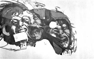
A.D. The heads here seem to be screaming.
R.V. This is part of a series, "Yonkers", which is a triptych. It grew out of a tragic event that I witnessed. I was at a get-together with friends. Suddenly there was a telephone call and there was a very tragic message to the family I was staying with at the time. The fact was that the lady who was the hostess and answered the telephone was told that her brother lost two children in a fire in Yonkers in one of the school's upper floors which was blocked off by the fire. That's why the name of the series is "Yonkers". It is a reflex to the sudden tragedy that actually affected the people unexpectedly, suddenly.
A.D. Those are the children?
R.V. Not necessarily. It's actually the idea, the human — if you see the transition from a smile to a scream and the disintegration of the human form in the last panel, where there is hardly any recognizable resemblance, any recognizable human element.
A.D. Can we say that the fire burns through the panels? I mean the idea of sequence.
R.V. It's more like a connection of images. It doesn't specifically relate to that human tragedy but more to the unpredictability, fragility of the human condition, in general.
A.D. How much time elapsed between the tragedy and the making of the prints?
R.V. Quite a long time. I immediately started to look for the face which would have some similarity to that
event, and I had a hard time finding it. The lady affected by the event happened to be Japanese, and I couldn't find a smiling Japanese face, especially a woman's face, as their faces are quite strained and serious. It took me seven months of searching. I actually gave up, then I found the face in a soap ad, smiling. I drew the face, and that face was sitting, so to say, on the litho stone for about a year. I knew the idea I wanted, but how to get the face precisely on stone, in the sequence? I was battling with that for a long time. In about a year that face started to move onto the pages. This image was carried with me for the longest time ever. But this was one of my most successful series, and it went into many collections and museums. The time I invested into this series came back in very rewarding terms.
A.D. A while ago you mentioned certain artists who are very meaningful to you. It occurs to me that one difference between you and Munch is that Munch is interested in the loneliness of the spirit, whereas it is violence that is most meaningful to you — physical violence.
R.V. I guess that is so. I think that in my life I have been affected by events or impressions that were actually violent — and this has passed into my work. I remember that my early works dealt with an element of constant depression. I think it's probably a reflex of the period I lived through in my sophomore and junior years. At the end of my freshman year, the Russians invaded the country; then, at the end of my sophomore year the Germans invaded the country. When I was about to graduate I was in the seventh semester of law school, the Germans closed the University because of student unrest. The Russians came back once more and at that time I left Lithuania. In all these experiences I was witnessing violence at one time or another as a young person, and is must have made an impact on my visual imagery.
A.D. A while back you compared the Aztecs to the Lithuanians, as the Lithuanians, you implied, are a beset people. Is this the lot of the Lithuanian people in the twentieth century, do you think?
R.V. Yes, I think so. I do see a strong parallel between Lithuanians and Indians, but the Indians are worse off. The advance or impact of an outside force affects the life, the basic reach of the group, tribe, or let's say a nation.
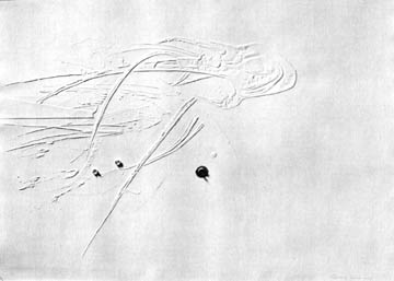
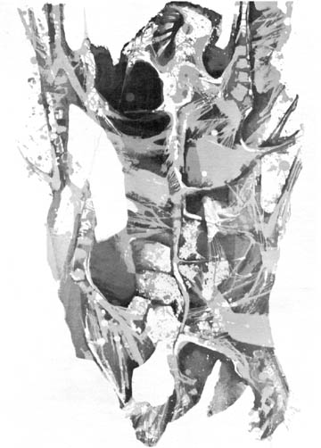
Take this white-on-white print. It was shown in an exhibition protesting our involvement in Vietnam. When I submitted it to the man who was selecting the show, he said: what does this gentle, nice graceful print have to do with Vietnam? [See "Imminent"]
A.D. It has holes in it.
R.V. Without any doubt. It has an element of torture, a touch of the imminent approaching tragedy.
A.D. We were talking about your Lithuanian heritage, what Lithuania means to you, and this series of "Raudos" most intimately of all the works discussed so far, has a direct bearing on your Lithuanian past. What does the term "Raudos" mean?
R.V. "Raudos is an extension of some bitter philosophy or outlook that is obvious throughout my work. The term "raudos" quite likely comes from the old Sanskrit Roda or Rauda, which means to cry, to lament, to wail. The earliest known raudos date from the ninth or tenth centuries A.D. They are one of the oldest known forms of Lithuanian folklore chants. They were sung on occasions of deaths, weddings, departures, sorrow, or long separations. There is an element of sorrow even in the case of the wedding. The bride is actually about to be separated from a household or a family. The fact that this series is black-on-black has a certain element of that mood, that idea. Since the chant itself is about a human loss, a permanent loss in the case of death, or temporary in the case of separation — also, by the way, sung when a soldier is recruited for twenty-five years into
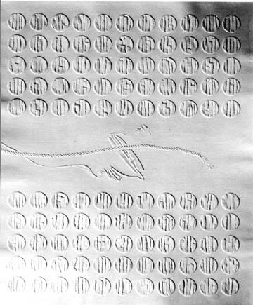
the Czar's army... In any case, the idea of raudos is about loss, temporary or permanent. These black-on-black prints were originally planned as invisible or unreadable — as a complete loss to the viewer.
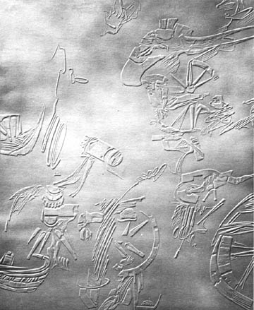
"Tiktis," from RAUDOS series. Black inkless intaglio relief. 1971. 23 3/4 x 27.5 in.
"Cuauehtemoc," from series HEW. Color litho. 1963. 20.5x30 in.
"Medvines," from RAUDOS series. Black inkless intaglio relief. 1971. 23. 3/4 x 27.5 in.
A.D. So from a distance they couldn't be seen or made out.
R.V. That's correct. They are very elaborate, done with great intensity and precision; but at the same time, like a Gothic cathedral, you couldn't read elements that would be high above the ground.
A.D. Do you have to come very close to see anything?
R.V. I did depart from that idea, though, and showed them under a special light because they're very quiet and somber, like the black sculptures of Nevelson, for instance. They require a special light, a special mood and set-up. They were shown as a group in a special construction.
A.D. There are fourteen and one-half prints in this particular series. Could you comment on one or two?
R.V. My relationship to the actual folk chant is often indirect or allegorical. It's unreadable. There are certain parallels. One aspect is that this imagery could go on, and on. In the chant there are entire phrases that would often repeat themselves in a slightly altered way, almost like a litany of sorts, and they could proceed, depending on the imagination of the singer and stop at any chosen time. So the series ends with a half image, with the idea of an abrupt stop.
A.D. We have the idea of endlessness here, that things could go on and on.
R.V. That's true. But we have this idea in my other work too, that visually things could go one and disappear and continue off the page. This series has a tape composed by an American composer Alvin Curran that goes with it when it is exhibited. In that tape an actual chant was used and electronically adapted to create a polyphonic effect. The words can't really be understood, yet the mood of the chant relates extremely well with the series. Again, there is no
physical or visual relationship between the tape, the chant and the series of prints. At the same time, the total impression is just as effective with the same impact, the same end.
A.D. What are the visual materials in your art work?
R.V. Often there are various sources. Sometimes something seemingly unimportant can inspire an idea or remind one of it. Sometimes these involve a rubbing from an ancient wall in Rome, some of these are drawings from a junkyard of deformed objects, some of these are a reflection on seventeenth century engravings in the Salzburg Museum.
A.D. These are the visual images?
R.V. I would say it's the material that somehow comes onto the pages in a transformed way.
A.D. And this connects itself with the idea of "Raudos" somehow. Could you amplify?
R.V. All of these objects, readable or unreadable, still refer in some way to a human sorrow or a human loss.
A.D. A stain on the wall can conjure up this idea for you?
R.V. Could be. Or, for instance, a form of a car that has been through an accident and suffered enormous impact — it could conjure up a reference of loss or a death or many associations that would remind us of the human condition. For instance, that print behind you was simply based on a scrap, metal sculpture in a studio in Rome. I made a rubbing from it. Not that I was fascinated by this scrap piece, as such, but the shape reminded me of certain associations and I took it from there and developed it into something more elaborate, but at the same time by no means a more directly readable form. But I think it has a certain impact, it communicates. The materials are quite disparate, but the cross-references often mix like unrelated elements into one impact. That reminds me of 'a story about Giacometti's sculpture — the man standing on an axis with two wheels on the sides, a tall, tall man. The source for that was an impression from the hospital, when his
friend was wheeled into an emergency room. The visual result of that experience is hardly related to a hospital or an operation room, but there are certain elements like a wheel, a man who is not lying but standing — just being above, almost like a skeleton of a person, or like a bier — such feelings permeated most of Giacometti's late sculpture.
A.D. And the individual looking at that would have no idea of the source.
R.V. Probably you have a feel or sense what the message was. For the other sculptures there may have been different sources, but we all read Giacometti universally pretty much the same way. The sources could be most disparate, most significant or insignificant to the average viewer, at the same time it could come into a cross-reference, even what I would call a symbolism when it comes to the final result. "Raudos", as many of my other works, have gone through very similar creative process. Yet the total impact of the series is unmistakable, even to those who do not know about Raudos as such.
A.D. You have once told me that there are no great giants producing art today. Do you feel disappointed about our times?
R.V. Absolutely, yes. I do feel disappointed. Only second and third rate talents are active in the visual arts today. So, instead of giants — we have midgets, gnomes and gnats. The really sharp declining point, I think, was in the mid sixties, although art historians saw this coming sooner, in the late fifties or so. However, I must say, I'm glad I lived through the most expansive, through the most energetic period of our American art.
A.D. How about yourself?
R.V. I feel I am cut-off from the life line of the sixties, the times of enormous expansion and growth, impact and dynamism of American art. It was a very vibrant time to live in, and I do miss it. I do feel cut-off, but I don't feel exhausted. What this means in my own creative life, I don't know yet.