|
LITUANUS
LITHUANIAN QUARTERLY JOURNAL OF ARTS AND SCIENCES
Volume 42, No.2 - Summer 1996
Editor of this issue: Robert A. Vitas
ISSN 0024-5089
Copyright © 1996 LITUANUS Foundation, Inc.
|

|
POSTERS BY ADA SUTKUS
ALGIMANTAS KEZYS
AND ADA SUTKUS
Poster art in its modern form is more than 100 years old and is a niche of considerable significance, particularly with such poster art giants as Toulouse-Lautrec and Picasso. The poster began as a convenient means of communication that consisted of a sheet of crude paper bearing the words of an announcement. As the poster evolved, a graphic or two accompanied the written text. Today, posters have elaborate designs which advertise products, services, and commercial or cultural ventures. After the huge and comprehensive poster show at the Museum of Modern Art in New York 20 years ago, the poster's stature as an art form was established.
Poster art in Lithuania followed the same path as in the rest of the world except during the period of the oppressive occupation of Lithuania by the former Soviet Union when there was no place for commercial advertising of goods or services. In the early stages of the occupation (1944-1960), only the political poster was officially allowed and propagated by the government. Gradually, the cultural poster emerged and reached artistic maturity in the late 1970's. The poster artists were specially trained, were furnished studios and were supported by the State to produce and print elaborately designed posters. Several poster contests were held during this heyday of poster art in Lithuania, and multi-awarded winner Juozas Galkus edited monograph Lietuvos plakatas which was published in Vilnius in the early 80's.
For the United States, the Lithuanian community which settled here after World War II, had its own poster specialists: Algirdas Kurauskas, Vincas Lukas, Vytautas Virkau, Ada Sutkus to mention a few.
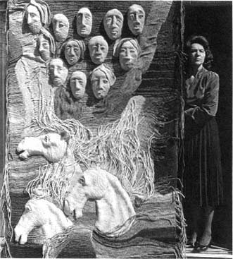
Ada Sutkus and her fiber piece S.O.S., 1988, 82"x 61"
Ada Korsakaitė-Sutkus was born in Lithuania. In 1949 she immigrated to the United States, settling in Los Angeles. She studied art at Immaculate Heart College, graduating cum laude in 1954. After graduation she joined the Mosaic Tile Co. in Los Angeles, where she executed decorative mosaic murals for schools, businesses, restaurants, as well as gambling casinos in Reno, Nevada. In 1956 she attended classes at the Art Students League and Pratt Institute in New York, taking courses in graphics. In 1959 Ada Sutkus joined the Valeška Church Art Studios in Chicago, where she executed works in stained glass and produced her largest pieces in mosaics and ceramics.
Ada's main technique in recent years has been textile weaving. She has created monumental fiber works ranging from large-size wall hangings to fiber sculptures of gigantic proportions. For her fiber pieces Ada manufactures her own heavy duty fibers by rolling yarns around a base, then sewing the fibers together to form three-dimensional fiber sculptures and wall hangings. She also created some stage sets for plays and shows.
Algimantas Kezys
Here is a portfolio of posters by Ada Sutkus who for more than 20 years has been creating posters for the Chicago Lithuanian Opera Company, which has been producing operas ranging from Verdi's Aida to the works of contemporary Lithuanian composers. Kazimieras Viktoras Banaitis' opera Jūratė and Kastytis was performed in Chicago April 20-21, 1996 marking the 40th anniversary of the Opera company. Ada Sutkus has created 18 Chicago Lithuanian Opera posters and nine program covers. Sutkus' poster style incorporates verbal information about the event, accurate interpretation of the subject matter and a balanced formal elements and esthetics. Ada explains her poster art:
"Many years ago I was asked to design a poster for a Lithuanian opera — Jūratė and Kastytis was being staged by the Lithuanian Opera Company in Chicago. My experience in poster art form was minimal at the time, but I was willing to do my best and went ahead with the project. The poster was used to advertise the premiere. For the program cover I designed a different version of the same theme using stronger colors with much better results. Thus began a series of posters and program cover designs for The Lithuanian Opera Company. This experience taught me many valuable lessons as the years went by. A close understanding with the printer is invaluable to get the desired results and suggestions by the opera group manager make a great deal of difference.
"Each time a new opera was being staged, it presented a problem to be solved on a two-dimensional plane. My reaction was to find out as much as possible about the opera story to be presented. The local library, as well as the Encyclopedia Britannica, served this purpose. Sometimes operas been in the past brought back memories of unforgettable performances by great talents and influenced the final result. For instance, it was my great fortune to hear Dame Joan Sutherland in Lucia Di Lammermoor and Lucia's visage in her mad scene was sufficient to say all that was needed in the poster. The same was true for the
Il Trovatore poster in which I was recalling the wonderful performance of Aldona Stempužis in her role of the gypsy Azucena. I used the principal four protagonists of the opera in a tight, flaming
composition. Doomed by their passions, they seem to be melding their final demise. Events in the art world influenced me as well. There was a rebirth of Art Nouveau in the seventies, and as the comic opera Elixir of Love was presented, it was natural for me to use the playful decorative line in the poster. A similar romantic line was employed for the opera Romeo and Juliet, and for the program cover of Nabucco.
"The romantic tone of most operas — Verdi's, Gounod's or our contemporary, Banaitis' — suggested a similar solution. The romantic, emotional approach is unmistakable in my posters. World events of the day or occurrences in my own life had a great impact upon the outcome of these projects. Sometimes I have so much to say concerning the story of the opera, and more, there is hardly any space left for the necessary text. This is quite evident in the poster for / Lituani. There is so much coming at us that the lettering barely fits in the overwrought composition. Certainly, I was overcome by the events in Lithuania at that time, and this is an opera dealing with the Lithuanian consciousness as well as the aspirations of freedom during the Crusades. Enemies then and in recent times produced bigger-than-life heroes.
"The designs of these posters are carried, most of the time, mainly by the black and white elements and their relationships. The searching, shifting black line which was probably a carry-over from my days as Church Art designer at Valeška Church Art Studios, has enough weight alone to carry the theme of various operas, however, color is important in poster art and I use it as a positive element. It is not just a decorative addition but has a strong, sometimes decisive role in the composition. It usually has an expressive quality which speaks a great deal about the opera itself and sometimes serves as a commentary concerning the times we live in.
"My approach to these projects is usually reverent. I try to reject any possibility of sentimentality by using bold lines and simple shapes. Now and then playful elements enter in via fluttering color forms or drifting lines. The posters were used by the Lithuanian Opera Company to announce their productions to the Lithuanian Community as well as the population at large. The expressive designs of these posters seem to fit with the purpose of The Lithuanian Opera
Company which aims to engage the opera lover and involve him or her in experiencing the unending drama of human existence which is the content of the opera art form."
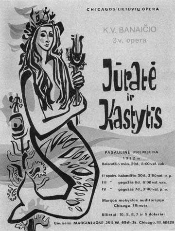
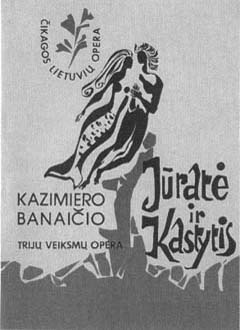
The very first poster designed by Ada Sutkus in 1972 for Banaitis' opera Jūratė and Kastytis". Printed in gold, lime-green and black.
22½" x 16½".
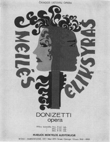
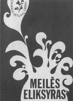
Poster for Donizetti's opera "Elixir of Love". 1975. Printed in gold, cinnamon and black.
22½" x 17½".
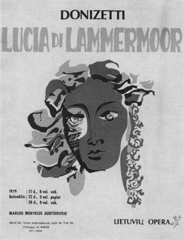
Poster for Donizetti's opera "Lucia di Lammermoor". 1979. Printed in orange, magenta and black.
22½" x 17½".
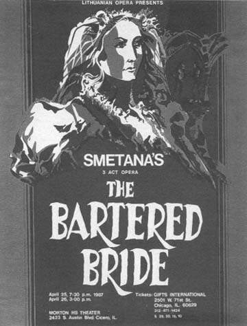
Poster for Smetana's opera "The Bartered Bride". 1987. Printed in green, magenta and black.
21½" x 16½".
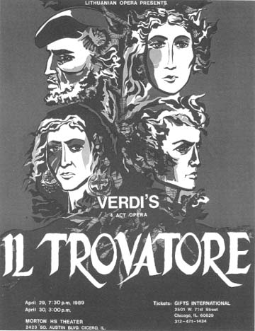
Poster for Verdi's opera "Il Trovatore". 1989. Printed in orange, magenta and black. 22½"
x 17½".
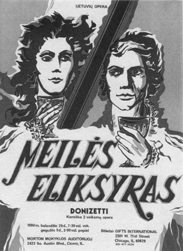
Poster for Donizetti's opera "Elixir of Love". 1990. Printed in orange, magenta and black.
22½" x 16½".
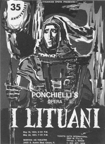
Poster for Ponchielli's opera "I Lituani". 1991. Printed in orange, taupe and black.
22½" x 16½".
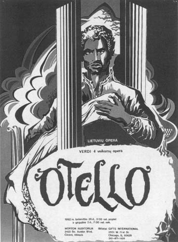
Poster for Verdi's opera "Otello". 1992. Printed in emerald-green gold and black. 22½"
x 16½".
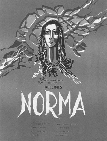
Poster for Bellini's opera "Norma". 1993. Printed in taupe, lavander and black.
22¼" x 17".
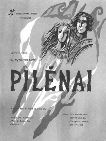
Poster for Klova's opera "Pilėnai". 1994. Printed in orange, gray and black.
22½" x 17".
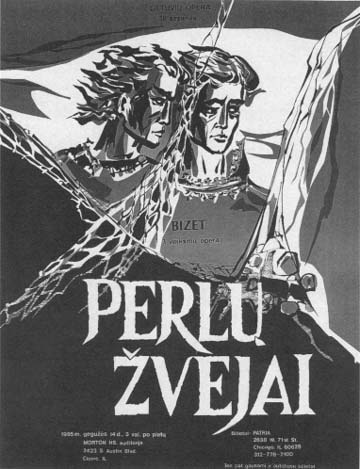
Poster for Bizet's opera "The Pearl Fishers". 1995. Printed in blue-green, magenta and black.
21½" x 16½".
 |
 |
Program cover for "Jūratė and Kastytis". 1972. Printed in orange and black.
10½" x 8".
|
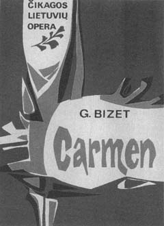
Program cover for "Carmen". 1973. Printed in orange, blue and black.
10½" x 8".
|
 |
 |
Program cover for "Elixir of Love". 1975. Printed in gold.
10½" x 8".
|
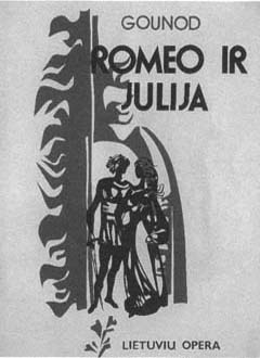
Program cover for "Romeo and Juliet". 1977. Printed in green and black.10½"
x 8".
|
 |
 |
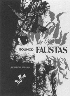
Program cover for "Faust". 1984. Printed in red and black.
10½" x 8".
|
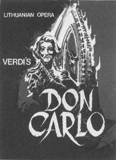
Program cover for "Don Carlo". 1985. Printed in magenta and black.
10½" x 8".
|
 |
 |
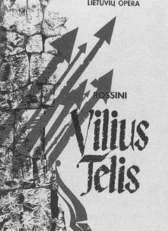
| Program cover for "William Tell". 1986. Printed in magenta and black.10½"
x 8". |
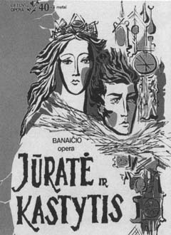
Program cover for "Jūratė and Kastytis".
1996. Printed in orange, magenta and black.10½"x8" |
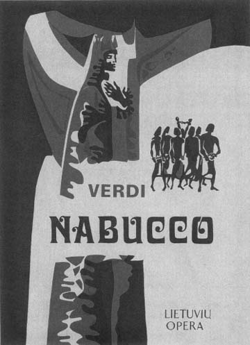
Program cover design by Ada Sutkus for Verdi's opera "Nabucco", staged by The Lithuanian Opera of Chicago in 1978. Printed in orange, magenta and black.
10½" x 8".